YouTube thumbnails are the highest-leverage visual asset most creators make. A 1% improvement in click-through rate on a video with 100,000 impressions is 1,000 extra views - from one image. Getting that image right matters more than most creators realize.
AI generation changes the thumbnail workflow completely. Instead of waiting for a photographer, spending hours in Photoshop, or using the same Canva template everyone else uses, you generate exactly what you need in minutes. This guide covers which models to use, how to prompt for thumbnails specifically, and the design principles that make thumbnails work.
How Thumbnails Work: What You're Actually Optimizing For
Before the prompts - understand what a thumbnail has to do.
A YouTube thumbnail has one job: stop the scroll and generate a click from someone who has never seen your channel before. It appears at approximately 200×113px in mobile search results and slightly larger in desktop recommendations. At that size, fine detail disappears. What remains is color, contrast, expression, and a clear subject.
The three elements that drive click-through:
1. Face with strong expression. Faces are the highest-performing thumbnail element - human attention is wired to read faces. But not any face. Neutral expressions underperform. Strong, clear emotional expressions - curiosity, shock, excitement, satisfaction, concern - outperform neutral by significant margins. The expression communicates what the viewer will feel watching the video.
2. High contrast. At thumbnail size, low-contrast images disappear. The subject needs to stand out from the background with clear visual separation. Dark subjects on dark backgrounds, pale subjects on white backgrounds - both get lost. Bright subject against contrasting background, or dramatic lighting that creates clear separation, reads at small size.
3. Value signal. The thumbnail should communicate what the video is about in under one second. Text, a recognizable object, a specific scenario - something that tells the viewer "this video is for me" before they read the title.
Model Selection by Thumbnail Type
Ideogram v3 - Thumbnails with Integrated Text
Ideogram v3 is the model for thumbnails where text is part of the visual design. Most other models produce distorted, unreadable text. Ideogram generates clean, legible, stylistically consistent text within images.
Best for:
- Thumbnails with a number or stat as the centerpiece ("47 Models")
- Title-integrated designs where the text is woven into the visual
- Thumbnails with visible labels, signs, or callout text
- Any design where text is visually part of the composition, not just overlaid
Prompt approach for Ideogram:
[Main visual subject],
bold text reading "[your exact text]" prominently displayed,
[color and style description],
high contrast, YouTube thumbnail composition,
16:9 aspect ratio
Ideogram is reliable for short phrases (2-5 words) and numbers. For longer text blocks, it becomes less consistent - in those cases, generate without text and add in Canva.
See Ideogram v3 vs Midjourney Text Rendering →
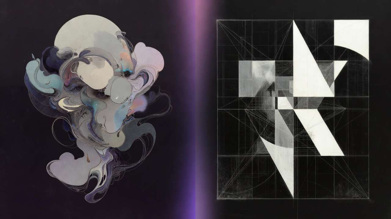
Midjourney - High-Impact Visual Thumbnails
Midjourney produces the most visually striking, high-contrast compositions of any image model on Cliprise. Its default output has a visual confidence - dramatic lighting, strong composition, saturated but not garish colors - that reads well at thumbnail size.
Best for:
- Concept thumbnails built around a compelling visual scene
- Dramatic or atmospheric imagery (before/after scenarios, aspirational content, dramatic reveals)
- Thumbnails where the image itself carries the message without text
- High-aesthetic content categories: travel, food, architecture, fashion, lifestyle
Prompt approach for Midjourney:
[Scene or concept], dramatic cinematic lighting,
[dominant color palette - bold and high contrast],
close composition with clear focal point,
photorealistic quality, YouTube thumbnail style
Contrast tip for Midjourney: Explicitly include contrast in the prompt. "High contrast lighting", "subject against dark background", or "bright subject, dark background" produces images that maintain their visual impact at small sizes.
Flux 2 - Photorealistic Faces and People
Flux 2 produces the most photorealistic human faces of any model on Cliprise. For thumbnails built around a person - a presenter, a character, a spokesperson - Flux 2 produces faces with the skin texture, expression accuracy, and realistic detail that makes them read as real photographs.
Best for:
- Tutorial and how-to thumbnails with a presenter character
- Reaction-face thumbnails (shocked, excited, curious expressions)
- Before/after person transformation thumbnails
- Any thumbnail where a specific face and expression is the primary element
Prompt approach for Flux 2:
Professional headshot of [person description],
[specific emotional expression - shocked, laughing, excited, concerned],
clean background or [specific environment],
YouTube thumbnail style, sharp focus on face,
high detail, studio lighting or [lighting description]
Expression specificity matters: "Surprised" is vague. "Eyes wide, mouth slightly open, eyebrows raised - genuine surprise expression" gives the model more signal. The more specific the expression description, the more precisely it renders.
Thumbnail Prompt Templates
The "Reaction Face" Thumbnail
High-performing format across education, tech, and commentary channels.
Photorealistic face of [person description],
expression of genuine [emotion: shock / disbelief / excitement],
eyes slightly wide, eyebrows raised,
looking directly at camera,
clean blurred background with [color] tones,
YouTube thumbnail, tight crop from shoulders up,
studio lighting, sharp focus, high detail
The "Number/Stat" Thumbnail (Ideogram)
Effective for list videos, rankings, and results-based content.
Bold number "[your number]" displayed prominently in the center,
[style: neon glow / carved stone / gold metallic / bold sans-serif],
background: [dark gradient / abstract texture / relevant visual],
high contrast, YouTube thumbnail 16:9,
clean professional design
The "Concept Scene" Thumbnail (Midjourney)
For content where the concept sells itself visually.
[Specific scene that encapsulates the video's core idea],
dramatic side lighting creating strong shadows,
[primary color] dominant palette, high saturation,
close framing with clear focal point,
cinematic quality, 16:9 composition,
bold and visually striking at small size
The "Before/After or Contrast" Thumbnail
Effective for transformation, improvement, or comparison content.
Split composition: left side shows [situation A - negative, cluttered, dark],
right side shows [situation B - positive, clean, bright],
clear visual separation between sides,
bold contrast between the two halves,
16:9 YouTube thumbnail format
Workflow: From Prompt to Uploaded Thumbnail
-
Generate in Cliprise at 16:9 aspect ratio. Run 3-4 variants per concept - thumbnail generation has variance, and small differences in composition make big differences in click-through.
-
Select at small size. Shrink the image preview to approximately thumbnail size (200×113px) before deciding which variant to use. What looks best at full size is not always what reads best at thumbnail size.
-
Add text in Canva (if not using Ideogram's integrated text). Import the best AI-generated image. Add your title text using a font consistent with your channel branding. Keep text short - 3-6 words maximum for thumbnail text. Use bold, high-contrast color with a subtle drop shadow for readability over any background.
-
Upscale before export. Upscale with Recraft Crisp Upscale → 2560×1440px for illustration/graphic thumbnails. Topaz Image Upscale for photorealistic face thumbnails. Export as JPEG at 90% quality - YouTube's 2MB file size limit.
What Doesn't Work at Thumbnail Size
Small text. Text that is readable at full image size becomes illegible at thumbnail size. Any text in the thumbnail should be large enough to read at a 200px wide display. If in doubt, go bigger.
Cluttered compositions. Multiple subjects, busy backgrounds, and complex scenes all compete for attention at small size. The best thumbnails have one clear focal point that reads instantly.
Low emotional expression. A calm, neutral face may be realistic but does not perform. Thumbnails are not profile photos - they are communication. Strong expression communicates what the viewer will experience.
Colors that clash with YouTube's interface. YouTube's background is white or dark. Thumbnails that are entirely white or entirely dark tend to disappear into the page. Strong, distinctive color that creates separation from the interface background performs better.
Note
Ideogram v3 and Flux 2 are on Cliprise; use Midjourney natively for Midjourney-specific output. Generate thumbnails across every style from one subscription. Try Cliprise Free →
Related Articles
YouTube thumbnail tools and guides:
- AI Thumbnail Generator 2026: Best Tools for YouTube →
- Best AI for YouTube Thumbnails 2026: Ideogram, Flux 2, Midjourney →
- AI Workflow for YouTube Thumbnails: High-Click Design System →
- AI for YouTube Thumbnails & Video Content →
- Best AI Platform for YouTube Creators 2026 →
Podcast thumbnails:
Image generation:
- AI Image Generation 2026: Complete Guide →
- Ideogram v3 vs Midjourney: Text Rendering →
- Seeds & Consistency: Reproducing Results →
Post-processing:
Models on Cliprise: