Related hubs: Best AI for YouTube thumbnails, Ideogram vs Midjourney text rendering, Models routing hub.
Podcast cover art is the first thing a potential listener sees in a feed, a search result, or a recommendation widget. At the 100-200px size it displays in most contexts, it competes with dozens of other shows for attention. The cover art determines whether someone reads the title - or scrolls past.
Episode thumbnails serve a different function. On YouTube podcast channels and video platforms, episode thumbnails drive click-through the same way YouTube video thumbnails do. Both need to work at small size, communicate clearly, and stay visually consistent across a series.
Podcast Cover Art vs Episode Thumbnails
Podcast cover art is the permanent square image that represents your entire show. It appears next to your podcast name in search results, feed recommendations, and library views. It lives for the lifetime of the podcast and should represent the show's identity, not a specific episode.
Episode thumbnails are per-episode images used primarily on YouTube video podcasts, social media preview posts, and video hosting platforms. They can include episode-specific content - guest names, episode numbers, specific topics - and change with every episode.
Both use the same AI generation workflow, but the design goals are different:
- Cover art: brand identity, longevity, visual distinctiveness, works at very small size
- Episode thumbnails: episode-specific content, click-through optimization, consistent with series while varying per episode
Platform Requirements
| Platform | Minimum | Recommended | Format |
|---|---|---|---|
| Spotify | 1400×1400px | 3000×3000px | JPEG or PNG |
| Apple Podcasts | 1400×1400px | 3000×3000px | JPEG or PNG |
| Amazon Music | 1400×1400px | 3000×3000px | JPEG |
| YouTube (video podcast) | 1280×720px | 2560×1440px | JPEG |
| YouTube (channel icon) | 800×800px | 800×800px | PNG |
Generate at 1:1 for all podcast platform cover art. Upscale to 3000×3000px with Recraft Crisp Upscale. Export as JPEG at 90%+ quality.
For YouTube episode thumbnails, generate at 16:9 and upscale to 2560×1440px.
Model Selection
Ideogram v3 - Cover Art with Integrated Podcast Name
Ideogram v3 reliably renders legible text within images - the podcast name, a tagline, an episode number. Other models produce distorted, unreadable text. Ideogram does not.
Use for:
- Cover art where the show name is typographically integrated into the visual
- Episode thumbnails with guest names baked in
- Any design where the text is compositionally part of the image
What Ideogram does well on text:
- Short names and phrases (1-5 words)
- Bold, clear font styles - serif, sans-serif, display fonts
- Text that is part of a designed composition rather than floating over a background
What to watch for: Ideogram handles short text accurately. Very long podcast names or complex multi-line layouts can produce distortion. For shows with longer names, consider generating the visual in Ideogram with a short version of the name, then recreating the full name in Canva at the exact typographic style you prefer.
Midjourney - Visual-First Cover Art
Midjourney produces the most visually compelling and distinctive imagery. For cover art built around a strong visual concept - with the show name added in Canva afterward - Midjourney consistently produces images with the aesthetic distinctiveness that makes podcast cover art memorable.
Use for:
- Strong conceptual or atmospheric cover art where the visual carries the identity
- Any style that benefits from Midjourney's interpretive aesthetic: editorial, abstract, cinematic, illustrative
- Cover art where you want a unique visual identity that stands out in a feed
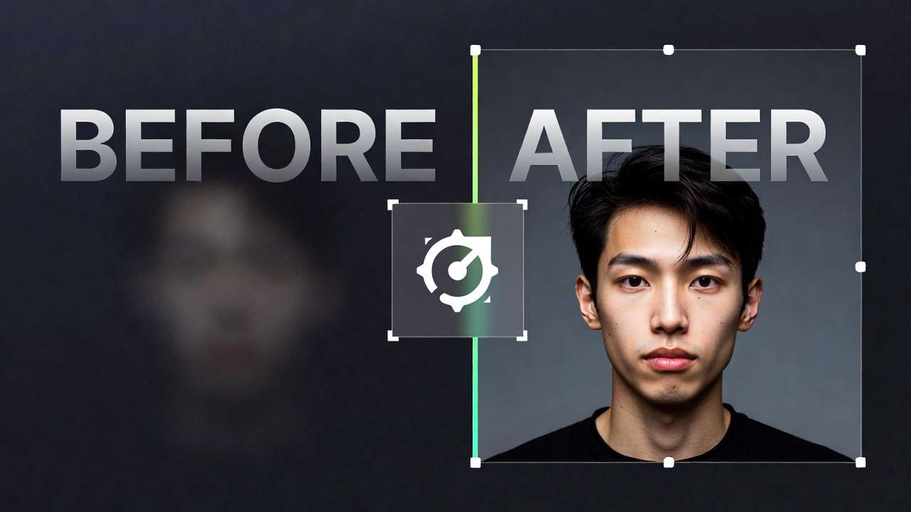
Flux 2 - Realistic Faces
Flux 2 for cover art built around a realistic portrait of the host or a consistent character persona. Photorealistic skin, accurate expressions, natural-looking people. Interview podcasts and personality-led shows often use the host's face as the cover art - if you want an AI version, Flux 2 produces the most realistic result.
Cover Art Prompt Templates
Brand Identity Cover - No Text (Midjourney, then Canva for text)
[Visual concept that represents the show's theme],
[dominant color palette that matches brand],
cinematic quality, bold and distinctive composition,
visually striking at small size, 1:1 square format,
[mood: dark and dramatic / bright and energetic / calm and intellectual]
Examples by show type:
True crime:
Dark urban alleyway at night, dramatic single light source,
deep shadows, atmospheric fog, cinematic thriller aesthetic,
bold visual, reads clearly at thumbnail size, square format
Business/entrepreneurship:
Abstract geometric pattern suggesting growth and momentum,
navy and gold color palette, clean modern aesthetic,
bold confident composition, square format, professional
Health and wellness:
Soft morning light through a window, minimalist interior,
plant on a white surface, calm and intentional mood,
warm neutral tones, square format, editorial quality
Text-Integrated Cover Art (Ideogram v3)
Podcast cover art with show name "[YOUR SHOW NAME]"
displayed prominently in [font style: bold sans-serif / elegant serif / handwritten],
[visual background: abstract gradient / relevant scene / textured surface],
[color palette], professional podcast artwork, 1:1 square format
Host Portrait Cover (Flux 2)
Professional podcast host portrait,
[host description: demographic, style, personality hints],
[background: clean gradient / blurred environment / branded color],
confident direct gaze, approachable expression,
podcast cover art style, square format, studio lighting
Episode Thumbnail Workflow
The most efficient approach for a podcast producing regular episodes: establish a Canva template from one AI-generated background, then drop in episode-specific content each week.
Step 1 - Generate the base background once.
Use Midjourney or Flux 2 to generate a background image that represents your show's visual identity without any episode-specific information. Upscale to 2560×1440 with Recraft Crisp Upscale. Import into Canva and set as the base layer.
Step 2 - Build the template in Canva.
Add your show's consistent design elements: your logo, a consistent color bar or overlay at the bottom third, a text area for the episode title or guest name. Use your brand fonts. Save this as a Canva template.
Step 3 - For each new episode:
Duplicate the template. Update only the episode-specific text: guest name, episode title or number, any specific hook phrase. Keep all design elements identical. Export as JPEG at 90%. Upload to YouTube and podcast platforms.
Result: Visually consistent episode artwork across your entire library. Distinctive enough that regular listeners recognize it instantly in their feed. Varying just enough per episode to communicate what this specific episode is about.
Guest Episode Thumbnails
For interview podcasts where the guest's face drives click-through:
Option A - AI portrait of the guest persona. If you do not have a clear photo of the guest, or want a stylized visual rather than a photo, generate a representative portrait with Flux 2 using the guest's demographic and style as description. This is clearly AI-generated; disclose appropriately.
Option B - Photo treatment in Canva. If you have a guest photo, use Canva's background removal and place the guest on your branded template background. Consistent placement rules (guest always on the right side, show name on the left) create visual consistency across guest episodes.
For the Ideogram approach to guest name text:
Podcast episode thumbnail,
guest name "[GUEST NAME]" displayed in bold clean typography,
[episode number or topic] in smaller text below,
[background matching show's visual identity],
16:9 format, professional podcast artwork
A podcast library that looks visually cohesive signals quality and longevity to new listeners browsing your back catalog. The design principles:
One dominant background approach. All episodes use the same background treatment - either the same generated background image, or a consistent style (same color palette, same texture type, same lighting approach). Switching between radically different visual styles episode-to-episode undermines brand recognition.
Consistent typography. Same font, same approximate size, same position on every thumbnail. Listeners recognize your show before they read the title when the typographic style is distinctive and consistent.
Same color palette. Define 2-3 colors that are your show's colors. Every thumbnail uses combinations of those colors. This is what makes a feed of your episodes look like a unified visual identity from a distance.
Seed values for generative consistency. If generating episode-specific AI visuals rather than using a fixed background, use the same seed value with variations on the same base prompt. See Seeds & Consistency →
Note
Ideogram v3, Midjourney alternatives, Flux 2 - all on Cliprise. Generate podcast cover art and episode thumbnails across every visual style from one subscription. Try Cliprise Free →
Related Articles
Podcast thumbnail and thumbnail tools:
- Podcast Creators: AI Thumbnail Generation Strategy →
- AI YouTube Thumbnail Generator Guide →
- AI Thumbnail Generator 2026: Best Tools →
- Best AI for YouTube Thumbnails 2026 →
Image generation:
- AI Image Generation 2026: Complete Guide →
- Ideogram v3 vs Midjourney: Text Rendering →
- Seeds & Consistency: Reproducing Results →
Upscaling for delivery:
Social media content:
Models on Cliprise: