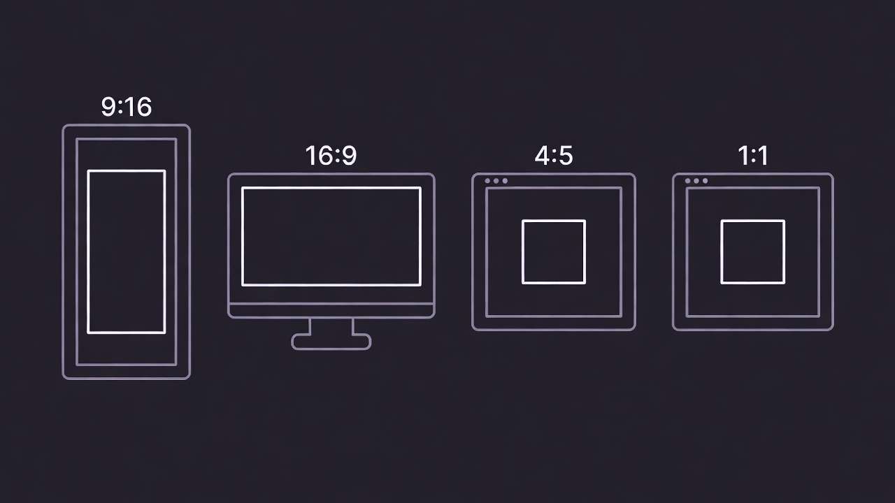
Choosing an aspect ratio isn't technical busywork. It's your first creative decision. The frame shapes everything - how viewers feel, where their eyes travel, what platforms amplify your work. Pair this with strong composition principles to maximize impact.
Pick the right canvas, then place the story inside it.
Quick Cheat-Sheet
| Ratio | Best for | Feels like | Safe-area tip | Typical subjects |
|---|---|---|---|---|
| 9:16 | Reels, TikTok, Shorts, Stories | Immersive, intimate, mobile-first | Keep text/action in center 40% | Portraits, dancers, tutorials, product demos |
| 16:9 | YouTube, trailers, B-roll, tutorials | Cinematic, spacious, epic | Leave top 15% clear for subtitles | Landscapes, environments, interviews, action scenes |
| 4:5 | Instagram Feed, fashion, editorial | Elegant, portrait-focused, gallery-ready | Top third for eyes, bottom for captions | Fashion, beauty close-ups, art, styled products |
| 1:1 | Product grids, avatars, thumbnails, logos | Balanced, symmetrical, clean | Center 60% for key elements | Products, abstract art, icons, looping animations |

9:16 - Vertical / Reels, TikTok, Shorts
Why It Works
Vertical fills the entire phone screen. No dead space. No compromises. It commands attention because the viewer can't look anywhere else. This is the native language of mobile storytelling.
Composition Rules
- Subject centered or on thirds - avoid awkward cropping at edges
- Eyes at top third - draws viewer's gaze naturally upward
- Generous headroom - don't clip foreheads or hats
- Keep key action in center 40% - platform UI (profile icons, CTAs, captions) lives in corners and edges
- Avoid micro-text near top/bottom - it gets buried under interface elements
Camera Ideas
- Slow push-in on subject's face
- Vertical tilt-up reveal (feet → face)
- Parallax layers (foreground passes by slower than background)
- Handheld intimacy with subtle shake
Lighting Tips
- Strong key light separates subject from background
- Rim/edge light prevents silhouette merging
- Top-down soft light flatters vertical faces
Do ✅
- Frame faces generously with breathing room
- Use depth to separate foreground from background
- Center dynamic action in safe zone
- Leave space for platform UI overlays
Don't ❌
- Crop heads or feet awkwardly
- Place critical text in top 20% or bottom 15%
- Use wide horizontal compositions - they feel cramped
- Forget vertical motion (up/down camera moves feel native)
Prompt Examples
Video (action):
"A free runner vaults between neon rooftops in steady rain, vertical framing, slow push-in, dramatic rim lighting, reflections on wet surfaces, high-contrast cyber-noir mood, subtle motion blur, eyes in upper third"
Video (product/demo):
"Handheld vertical shot of hands pouring latte art, overhead angle, soft morning light through window, shallow focus on cup, warm cafe atmosphere, gentle camera sway, center-locked composition"
Image (portrait):
"Editorial close-up of a dancer under soft top light, vertical composition, eyes on upper third, shallow depth of field, gentle haze, warm amber tones, clean background separation, elegant and intimate"
16:9 - Wide / YouTube, B-roll, Cinematic
Why It Works
This is cinema's native tongue. Horizontal space lets stories breathe. You have room for lateral movement, environmental context, and layered depth. It's the gold standard for tutorials, documentaries, and anything that lives on YouTube or big screens.
Composition Rules
- Leading lines guide the eye across the frame
- Subject on thirds creates dynamic tension
- Headroom for subtitles - leave top 15% clear
- Foreground-midground-background layering adds depth
- Space for motion - if subject moves left, frame them right
Camera Ideas
- Lateral dolly or tracking shot
- Slow panoramic pan across landscape
- Crane-like rise or descent
- Orbital movement around subject
Do ✅
- Use negative space for text overlays
- Frame interviews with look-room (space in gaze direction)
- Layer depth with foreground elements
- Think in thirds, not center-locked

Don't ❌
- Center-lock static subjects (feels amateurish)
- Ignore subtitle safe zones
- Use tight vertical crops (feels claustrophobic)
- Forget horizontal motion bias
Prompt Examples
Video (landscape/action):
"Wide aerial of mist drifting over pine valleys at dawn, golden god rays breaking through clouds, slow pan left, layered depth with foreground branches, tranquil cinematic atmosphere, soft focus haze, teal and amber tones"
Video (dialog/interview-style):
"Medium shot of chef talking to camera in rustic kitchen, framed on left third with look-room right, soft window light, shallow depth blurring background shelves, warm intimate vibe, subtle handheld sway"
Image (environment/hero scene):
"Epic low-angle wide shot of lone astronaut standing on Mars ridge at sunset, dramatic sky gradient, figure on right third, layered rocky terrain, cinematic science fiction atmosphere, dust particles in light rays"
4:5 - Portrait-forward / Instagram Feed
Why It Works
4:5 dominates Instagram feeds because it captures more vertical real estate without going full-screen. It's the sweet spot for fashion, beauty, and editorial work - tall enough to feel immersive, wide enough to avoid cramped framing.
Composition Rules
- Eyes slightly above center - natural portrait framing
- Negative space for text overlays - especially top or bottom zones
- Avoid cramped edges - give limbs breathing room
- Vertical elegance - this ratio loves length and grace
Camera Ideas
- Subtle push-in on subject's face
- Slow vertical tilt revealing outfit
- Shallow DOF isolating subject from background
- Static locked composition for editorial stillness
Do ✅
- Frame full-body or 3/4 portraits gracefully
- Use negative space intentionally
- Keep eyes in upper half
- Design for thumb-stopping scroll appeal
Don't ❌
- Crop awkwardly at joints (knees, elbows)
- Clutter edges with competing elements
- Center-lock without purpose
- Forget this lives in feeds, not full-screen
Prompt Examples
Video (fashion/beauty close-up):
"Slow-motion close-up of model's face turning toward camera, 4:5 portrait frame, soft diffused beauty lighting, eyes slightly above center, gentle wind in hair, shallow focus on skin texture, elegant and aspirational mood"
Image (editorial portrait):
"Studio portrait of a model in satin fabric, soft wrap lighting, eyes slightly above center, creamy bokeh background, muted mauve and cream palette, elegant editorial fashion vibe, vertical grace, clean composition"
Image (stylized product):
"Perfume bottle on marble pedestal with dried flowers, 4:5 portrait composition, soft gradient backdrop, rim lighting on glass edges, moody and luxurious atmosphere, negative space above for text overlay"
1:1 - Square / Product, Logos, Thumbnails
Why It Works
Square is balanced, calm, and endlessly versatile. It's the default for product grids, profile avatars, and any design that needs to work everywhere. Symmetry feels intentional. Chaos feels curated.
Composition Rules
- Centered symmetry is your friend here
- Circular or radial motifs feel native to square frames
- Keep text within middle 60% - edges get cropped on some platforms
- Crisp, clean edges - no ambiguity about frame boundaries

Lighting Tips
- Soft gradient backgrounds create depth without distraction
- Clear subject separation with contrast or rim light
- Even, flattering light for products and portraits

Do ✅
- Embrace centered composition
- Use symmetry intentionally
- Design for thumbnail clarity
- Think grids and tiles
Don't ❌
- Force horizontal or vertical dynamics
- Place critical info in corners
- Overcomplicate - square loves simplicity
- Forget this often lives tiny (icons, avatars)
Prompt Examples
Image (clean product hero):
"Minimalist perfume bottle centered on soft gradient backdrop, subtle shadow beneath, crisp reflections on surface, clean luxury composition, gentle rim glow, square symmetry, muted elegance, commercial product photography"
Image (logo/mark abstract):
"Abstract geometric logo mark in center, radial gradient background fading dark to light, metallic gold accents, clean symmetrical composition, modern premium brand aesthetic, square format, sharp edges"
Video (loopable micro-motion product spin):
"Seamless 360° product rotation on white backdrop, watch centered in square frame, subtle highlight roll across case, smooth eased motion, locked center composition, perfect loop, studio-clean lighting"
Composition Fundamentals (All Ratios)
These principles work everywhere. Master them once, apply them forever.
Rule of Thirds vs Centered Symmetry
- Thirds: Dynamic, cinematic, guides the eye on a journey
- Centered: Powerful, intentional, confrontational, symmetrical
- When to choose: Thirds for storytelling, center for icons and statements
Headroom & Lead Room
- Headroom: Space above subject's head - don't clip
- Lead room: Space in direction of motion or gaze
- Leave breathing room. Tight crops feel amateur.
Foreground-Midground-Background
Depth separates premium from flat. Layer elements at different distances. Add haze, dust, or bokeh to distinguish planes.
Safe Areas
Platform UIs overlay your content. Keep critical elements (faces, text, logos) in the center 60-70% of frame. Corners and edges get covered.
Tech Tip: On 9:16, keep titles within the middle 60% to avoid UI overlays. On 16:9, reserve top 15% for subtitles.
Motion Framing
- Leave space ahead of moving subjects
- Don't cut limbs at joints (elbows, knees, wrists)
- If subject looks left, frame them right
Color & Contrast
Separate subject from background. Use rim light, color contrast, or depth of field. Avoid merging silhouettes into similar-toned backgrounds.
Common Pitfalls
| Problem | Fix |
|---|---|
| Vertical video with wide story layout | Reframe subject, center action, use vertical camera moves |
| Text near edges on 9:16 | Move captions to center-safe area (middle 40%) |
| Flat, lifeless look | Add rim light, atmospheric haze, or foreground/background separation |
| Cropping at joints | Frame full limbs or cut mid-bone, never at elbows/knees |
| Ignoring platform UI | Test your frame with overlays visible - profile icons, buttons, captions all steal space |

